Global Analysis
ghed_df <-
  read_excel("data/GHED_data.XLSX") %>%
  janitor::clean_names()
Let’s start with an overview of the Global Health Expenditure Dataset and take a look at global trends.
We started our exploratory analysis by defining which income levels, WHO regions, and specific countries to compare and analyze.
To conduct income-level analysis, we used the income levels which were pre-defined in the GHED: Low, Lower-Middle, Upper-Middle, and High incomes. To conduct WHO region analysis, we utilized the WHO regions designated in the GHED dataset. These regions are: AFR (African Region), AMR (Region of the Americas), EMR (Eastern Mediterranean Region), EUR (European Region), SEAR (South-East Asian Region), and WPR (Western Pacific Region).
We considered multiple strategies when selecting which countries to compare and analyze. Ultimately, we decided to use the UN Country Classification document as a reference source to identify developed and developing countries in order to compare government spending in developed countries with high incomes and government spending in developing countries with low incomes.
ghed_df %>%
  select(country, country_code, region_who, `Income Group` = income_group) %>%
  distinct() %>%
  mutate(
    `Income Group` = as.factor(`Income Group`),
    `Income Group` = factor(`Income Group`, levels = c("Low","Low-Mid","Up-Mid","Hi"))
  ) %>%
  group_by(region_who) %>%
  mutate(
    num_countries = n()
  ) %>%
  group_by(region_who, `Income Group`, num_countries) %>%
  summarize(n = n()) %>%
  mutate(
    perc_income_group = 100*(n/num_countries)
  ) %>%
  ggplot(aes(x = `Income Group`,y = perc_income_group)) +
  geom_bar(aes(fill = `Income Group`),stat = "identity") +
  facet_grid(~ region_who) +
  theme(axis.text.x = element_text(angle = 80, hjust = 1)) +
  ggtitle("Distribution of income levels of countries in each WHO region") +
  ylab("% of countries in region") +
  xlab("Country income group (2019)")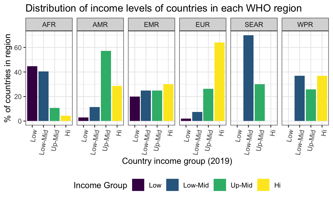
The bar plots above show the distribution of income levels of countries (categorized in 2019) in each WHO region: AFR, AMR, EMR, EUR, SEAR, and WPR.
Highest proportion of income group type by region:
Low income: AFR
Low-Mid income: SEAR
Up-Mid income: AMR
Hi income: EUR
Income group and total healthcare expenditure
ghed_df %>%
  select(country, country_code, region_who, income_group, year, che_gdp, che_pc_usd) %>%
  filter(year == 2019) %>%
  mutate(
    income_group = as.factor(income_group),
    income_group = factor(income_group, levels = c("Low","Low-Mid","Up-Mid","Hi"))
  ) %>%
  group_by(income_group) %>%
  summarise(mean_che_gdp = mean(che_gdp,na.rm = TRUE), mean_che_pc_usd = mean(che_pc_usd,na.rm = TRUE)) %>%
  rename("Income Group" = "income_group") %>%
  rename("Mean Current Health Expenditure as % of GDP" = "mean_che_gdp") %>%
  rename("Mean Current Health Expenditure per Capita (US$)" = "mean_che_pc_usd") %>%
knitr::kable(digits = 2)| Income Group | Mean Current Health Expenditure as % of GDP | Mean Current Health Expenditure per Capita (US$) |
|---|---|---|
| Low | 6.01 | 39.25 |
| Low-Mid | 5.08 | 126.69 |
| Up-Mid | 6.90 | 482.74 |
| Hi | 7.69 | 2937.29 |
The mean current health expenditure (CHE) per capita in US$ increases going from low income to high income groups. The highest CHE as % of gross domestic product (GDP) belongs to countries in the highest income group at 7.67%; however, we see that this percentage for all income groups ranges from roughly 5-8%, so the amount per capita a country is able to dedicate for health expenditure depends and varies based on country GDP and income level.
WHO region and total healthcare expenditure
ghed_df %>%
  select(country, country_code, region_who, income_group, year, che_gdp, che_pc_usd) %>%
  filter(year == 2019) %>%
  group_by(region_who) %>%
  summarise(mean_che_gdp = mean(che_gdp,na.rm = TRUE), mean_che_pc_usd = mean(che_pc_usd,na.rm = TRUE)) %>%
  arrange(mean_che_pc_usd) %>%
  rename("WHO Region" = "region_who") %>%
  rename("Mean Current Health Expenditure as % of GDP" = "mean_che_gdp") %>%
  rename("Mean Current Health Expenditure per Capita (US$)" = "mean_che_pc_usd") %>%
knitr::kable(digits = 2)| WHO Region | Mean Current Health Expenditure as % of GDP | Mean Current Health Expenditure per Capita (US$) |
|---|---|---|
| AFR | 5.33 | 128.38 |
| SEAR | 4.42 | 186.29 |
| EMR | 5.52 | 634.23 |
| AMR | 7.20 | 1081.32 |
| WPR | 7.32 | 1107.48 |
| EUR | 7.63 | 2461.09 |
The AFR region has the lowest mean CHE per capita (US$) while the EUR region has the highest. While the expenditure as % of GDP ranges from 4-8%, we note that the EUR region has countries that, on average, spend the highest percentage of their GDP on health at 7.6%. So even though the EUR region has the highest proportion of high income countries, these countries still dedicate the highest proportion of their GDP to healthcare, followed by the WPR and AMR regions.
Developed countries and their spending over time
The major developed economies we examined are the G-7 countries, consisting of: Canada, Japan, France, Germany, Italy, United Kingdom, and the United States of America.
total_spending_developed_plot =
  ghed_df %>%
  select(country, country_code, region_who, income_group, year, che_gdp, che_pc_usd) %>%
  filter(country == "United States of America" |
         country == "United Kingdom" |
         country == "Italy" |
         country == "Germany" |
         country == "France" |
         country == "Japan" |
         country == "Canada") %>%
  mutate(
    year = as.numeric(year)
  ) %>%
  group_by(country) %>%
  ggplot(aes(x = year,y = che_pc_usd, color = country),show.legend = FALSE) +
  geom_line(show.legend = FALSE) +
  geom_point(show.legend = FALSE) +
  ggtitle("Total spending over time in developed countries (per capita)") +
  xlab("Year") +
  ylab("Total health expenditure (US$)") +
  scale_colour_viridis_d()
govt_spending_developed_plot =
ghed_df %>%
select(country, country_code, region_who, income_group, year, gghed_pc_usd) %>%
filter(country == "United States of America" |
country == "United Kingdom" |
country == "Italy" |
country == "Germany" |
country == "France" |
country == "Japan" |
country == "Canada") %>%
mutate(
year = as.numeric(year)
) %>%
group_by(country) %>%
ggplot(aes(x = year,y = gghed_pc_usd, color = country)) +
geom_line() +
geom_point() +
ggtitle("Government spending over time in developed countries (per capita)") +
xlab("Year") +
ylab("Government health expenditure (US$)") +
scale_colour_viridis_d()total_spending_developed_plot 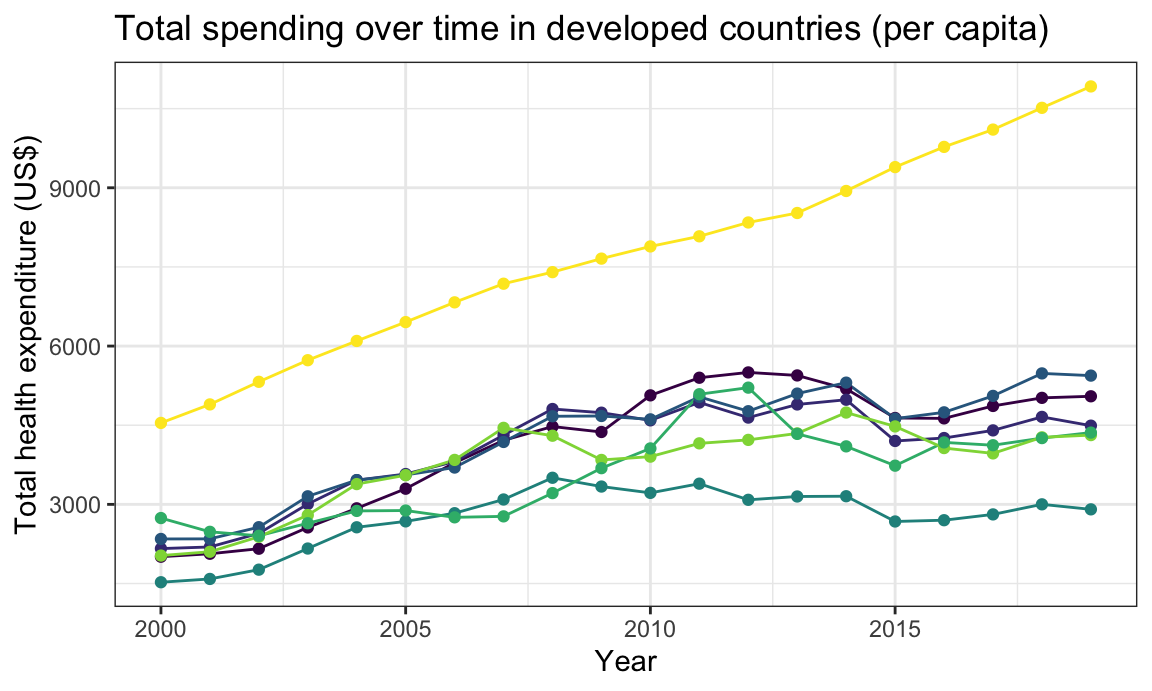
govt_spending_developed_plot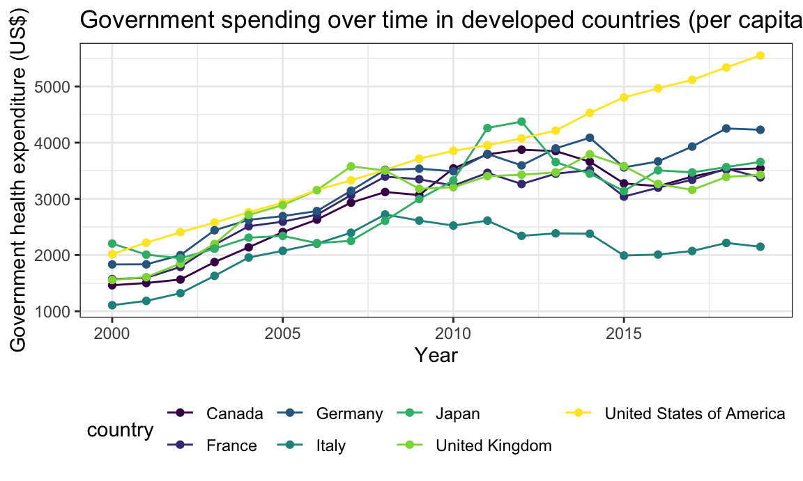
The United States has the highest total and government spending per capita over time and grows at a steeper rate year over year than the other countries. All countries have higher health expenditure in 2019 compared to 2000. It’s interesting to note that Japan had a spike in government health expenditure around 2011 and 2012, exceeding the US - upon looking into this, we note that the deadly earthquake and tsunami that hit Japan in 2011 coincides with this increase. With thousands dead and injured and many resources scarce, the government stepped in to provide relief to its citizens and help with recovery and health concerns after the natural disaster struck.
Note that total spending per capita ranges from $1500 to $11000 and government spending per capita ranges from $1000 to $5500.
Developing countries and their spending over time
The developing economies we dive into are: Morocco, Uganda, South Africa, Senegal, Nepal, Iraq, Haiti, Mexico, and Argentina.
total_spending_developing_plot =
  ghed_df %>%
  select(country, country_code, region_who, income_group, year, che_gdp, che_pc_usd) %>%
  filter(country == "Morocco" |
         country == "Uganda" |
         country == "South Africa" |
         country == "Senegal" |
         country == "Nepal" |
         country == "Iraq" |
         country == "Haiti" |
         country == "Mexico" |
         country == "Argentina") %>%
  mutate(
    year = as.numeric(year)
  ) %>%
  group_by(country) %>%
  ggplot(aes(x = year,y = che_pc_usd, color = country),show.legend = FALSE) +
  geom_line(show.legend = FALSE) +
  geom_point(show.legend = FALSE) +
  ggtitle("Total spending over time in developing countries (per capita)") +
  xlab("Year") +
  ylab("Total health expenditure (US$)") +
  scale_colour_viridis_d()
govt_spending_developing_plot =
ghed_df %>%
select(country, country_code, region_who, income_group, year, gghed_pc_usd) %>%
filter(country == "Morocco" |
country == "Uganda" |
country == "South Africa" |
country == "Senegal" |
country == "Nepal" |
country == "Iraq" |
country == "Haiti" |
country == "Mexico" |
country == "Argentina") %>%
mutate(
year = as.numeric(year)
) %>%
group_by(country) %>%
ggplot(aes(x = year,y = gghed_pc_usd, color = country)) +
geom_line() +
geom_point() +
ggtitle("Government spending over time in developing countries (per capita)") +
xlab("Year") +
ylab("Government health expenditure (US$)") +
scale_colour_viridis_d()total_spending_developing_plot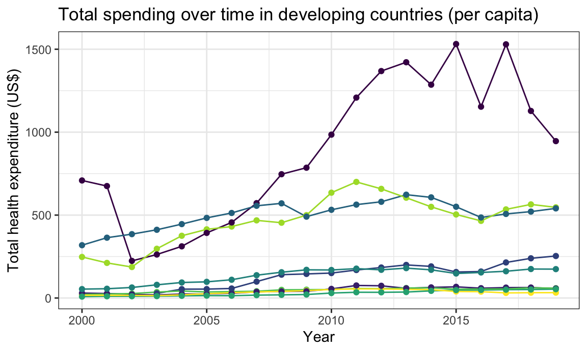
govt_spending_developing_plot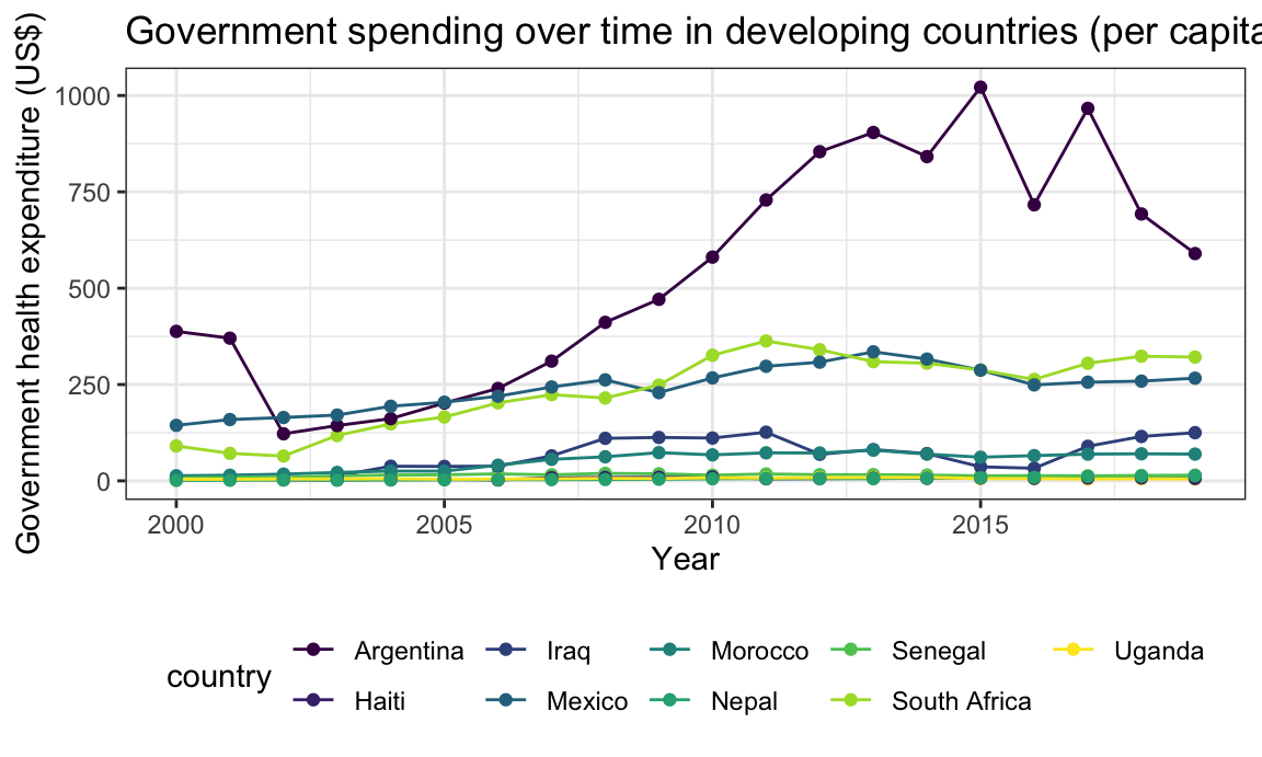
Among these developing economies, Argentina has the highest total and government spending per capita over time and grows at a steeper rate year over year. According to an Economist article, Argentina’s government has been devoting more resources to healthcare over the years to address healthcare inequalities. Some of the African countries, such as Senegal, South Africa, and Uganda, don’t seem to have increased health spending much, if at all, over the last two decades.
Note that total spending per capita ranges from close to $0 to $1500 and government spending per capita ranges from close to $0 to $1000. Both these ranges are much less than that of the G-7 developed economies mentioned above: total spending per capita from $1500 to $11000 and government spending per capita from $1000 to $5500.
Expenditure categories by income level and WHO regions
We wanted to continue our global analysis by examining health care expenditure by category across the defined income levels and WHO regions. We focused on expenditure in 2019 since this was the most recent available data. We wanted to examine primary health care, preventative care vs. curative care, and infectious diseases vs. noncommunicable diseases. We focused on evaluating expenditure in million constant US dollars, expenditure as a percent of GDP, and expenditure as a percent of CHE. We used million constant US dollars as the unit of expenditure in this analysis to help standardize comparison across the countries in each region, and because there was more data available for this particular unit.
We started by examining the average primary health care spending across income levels and WHO regions.
PHC_df =
  ghed_df %>%
  filter(year == 2019) %>%
  drop_na(phc_usd_pc) %>%
  group_by(income_group) %>%
  summarize(
    n_countries = n(),
    avg_phc = mean(phc_usd_pc))

income_constant =
  PHC_df %>%
  ggplot(aes(x = fct_relevel(as.factor(income_group), c("Low", "Low-Mid", "Up-Mid", "Hi")), y = avg_phc,  fill = income_group)) +
  geom_col() +
  labs(
    x = "Income level",
    y = "Average spending"
  ) +
  theme(axis.text.x = element_text(angle = 90)) +
  theme(legend.position = "none")

phc_ghed =
  ghed_df %>%
  filter(year == 2019) %>%
  drop_na(phc_usd_pc) %>%
  group_by(region_who) %>%
  summarize(
    n_countries = n(),
    avg_primary = mean(phc_usd_pc)
  )

region_constant =
  phc_ghed %>%
  ggplot(aes(x = reorder(region_who, avg_primary), y = avg_primary, fill = region_who)) +
  geom_bar(stat = "Identity") +
  labs(
    x = "WHO region",
    y = "Average spending"
  ) +
  theme(axis.text.x = element_text(angle = 90)) +
  theme(legend.position = "none")

combined_constant = income_constant + region_constant

combined_constant +
  plot_annotation(
    title = "Primary health care spending in million constant US$"
  )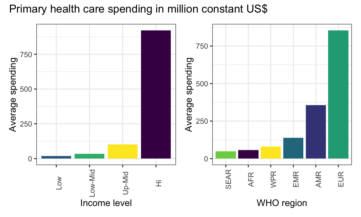
High income countries spent the most on average on PHC, while low income countries spent the least. The European region spent the most on average on PHC, while the South-East Asian region spent the least on average on PHC.
PHC_df =
  ghed_df %>%
  filter(year == 2019) %>%
  drop_na(phc_usd_pc, gdp_pc_usd) %>%
  group_by(income_group) %>%
  summarize(
    n_countries = n(),
    avg_phc = mean(phc_usd_pc / gdp_pc_usd))

income_gdp =
  PHC_df %>%
  ggplot(aes(x = fct_relevel(as.factor(income_group), c("Low", "Low-Mid", "Up-Mid", "Hi")), y = avg_phc,  fill = income_group)) +
  geom_col() +
  labs(
    x = "Income level",
    y = "Average spending"
  ) +
  theme(axis.text.x = element_text(angle = 90)) +
  theme(legend.position = "none")

phc_gdp_ghed =
  ghed_df %>%
  filter(year == 2019) %>%
  drop_na(phc_usd_pc, gdp_pc_usd) %>%
  group_by(region_who) %>%
  summarize(
    n_countries = n(),
    avg_primary_gdp = mean(phc_usd_pc / gdp_pc_usd)
  )

region_gdp =
  phc_gdp_ghed %>%
  ggplot(aes(x = reorder(region_who, avg_primary_gdp), y = avg_primary_gdp, fill = region_who)) +
  geom_bar(stat = "Identity") +
  labs(
    x = "WHO region",
    y = "Average spending"
  ) +
  theme(axis.text.x = element_text(angle = 90)) +
  theme(legend.position = "none")

combined_gdp = income_gdp + region_gdp

combined_gdp +
  plot_annotation(
    title = "Primary health care spending as % of GDP"
  )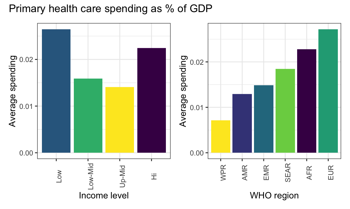
Low income countries spent the most on average on PHC as a proportion of GDP, while up-mid income countries spent the least. It is interesting that low income countries actually spent more as compared to high income countries. The European region spent the most on average on PHC as a proportion of GDP, while the Western Pacific region spent the least.
PHC_df =
  ghed_df %>%
  filter(year == 2019) %>%
  drop_na(phc_usd_pc, che_pc_usd) %>%
  group_by(income_group) %>%
  summarize(
    n_countries = n(),
    avg_phc = mean(phc_usd_pc / che_pc_usd))

income_che =
  PHC_df %>%
  ggplot(aes(x = fct_relevel(as.factor(income_group), c("Low", "Low-Mid", "Up-Mid", "Hi")), y = avg_phc,  fill = income_group)) +
  geom_col() +
  labs(
    x = "Income level",
    y = "Average spending"
  ) +
  theme(axis.text.x = element_text(angle = 90)) +
  theme(legend.position = "none")

phc_che_ghed =
  ghed_df %>%
  filter(year == 2019) %>%
  drop_na(phc_usd_pc, che_pc_usd) %>%
  group_by(region_who) %>%
  summarize(
    n_countries = n(),
    avg_primary_che = mean(phc_usd_pc / che_pc_usd)
  )

region_che =
  phc_che_ghed %>%
  ggplot(aes(x = reorder(region_who, avg_primary_che), y = avg_primary_che, fill = region_who)) +
  geom_bar(stat = "Identity") +
  labs(
    x = "WHO region",
    y = "Average spending"
  ) +
  theme(axis.text.x = element_text(angle = 90)) +
  theme(legend.position = "none")

combined_che = income_che + region_che

combined_che +
  plot_annotation(
    title = "Primary health care spending as % of current health expenditure"
  )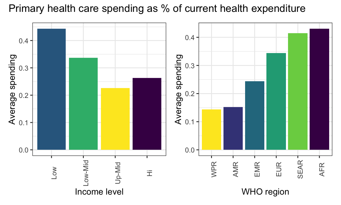
Low income countries spent the most on average on PHC as a proportion of current health expenditure, while upper-middle income countries spent the least. Low income countries actually spent significantly more in comparison to high income countries. Interestingly, African region countries spent the most on average on PHC as a proportion of current health expenditure, while Region of the Americas and Western Pacific region spent the least.
We continued our analysis by comparing average preventative spending and curative spending.
cp_df =
  ghed_df %>%
  filter(year == 2019) %>%
  drop_na(hc1_usd2019, hc6_usd2019) %>%
  group_by(income_group) %>%
  summarize(
    n_countries = n(),
    `Curative` = mean(hc1_usd2019),
    `Preventive` = mean(hc6_usd2019)
  ) %>%
  pivot_longer(
    `Curative`:`Preventive`,
    names_to = "Spend Type",
    values_to = "average_spending"
  )

income_cp =
  cp_df %>%
    ggplot(aes(x = reorder(income_group, average_spending), y = average_spending, fill = `Spend Type`)) +
    geom_bar(stat = "Identity", position = "Dodge") +
    labs(
      x = "Income level",
      y = "Average spending"
    ) +
  theme(axis.text.x = element_text(angle = 90)) +
  theme(legend.position = "none")

cp_df_2 =
  ghed_df %>%
  filter(year == 2019) %>%
  drop_na(hc1_usd2019, hc6_usd2019) %>%
  group_by(region_who) %>%
  summarize(
    n_countries = n(),
    `Curative` = mean(hc1_usd2019),
    `Preventive` = mean(hc6_usd2019)
  ) %>%
  pivot_longer(
    `Curative`:`Preventive`,
    names_to = "Spend Type",
    values_to = "average_spending"
  )

group_cp <-
    cp_df_2 %>%
    ggplot(aes(x = reorder(region_who, average_spending), y = average_spending, fill = `Spend Type`)) +
    geom_bar(stat = "Identity", position = "Dodge") +
    labs(
      x = "WHO region",
      y = "Average spending"
    ) +
  theme(axis.text.x = element_text(angle = 90)) +
  theme(legend.position = "right")

combined_cp <- income_cp + group_cp

combined_cp +
  plot_annotation(
    title = "Preventive vs. curative spending in million constant US$"
  )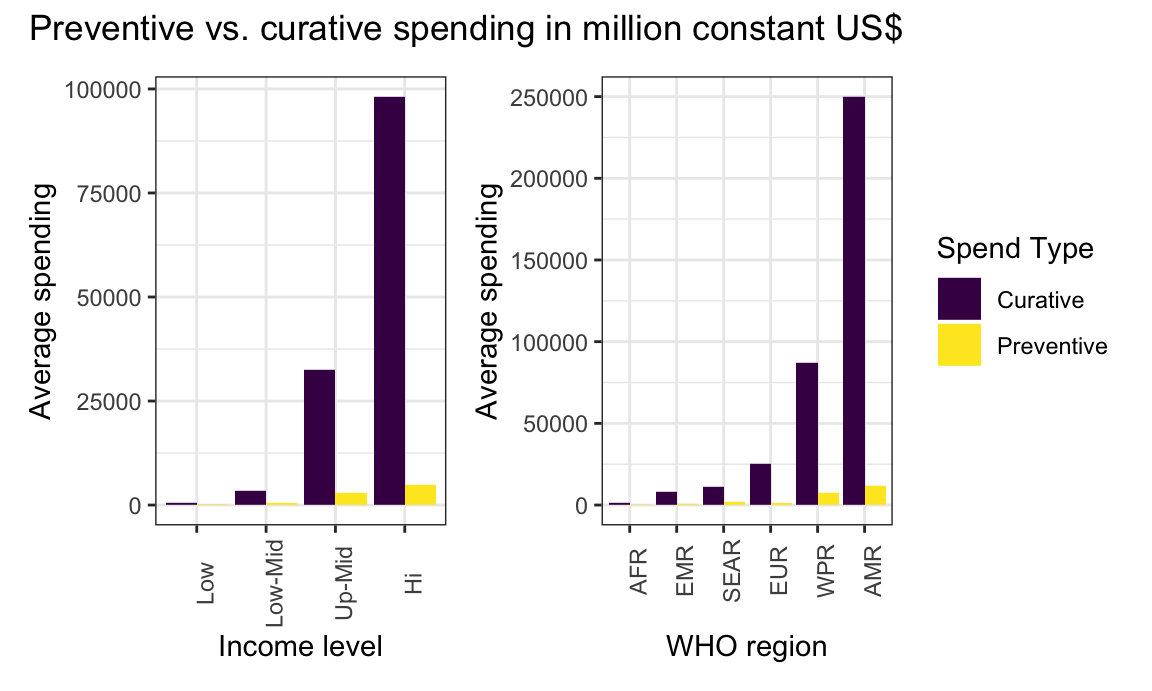
Across all income levels and WHO regions, countries on average spent much more on curative care than on preventative care. This reflects that global health care practices seem to prioritize curative care, and focus less on preventative care for patients. On average, high income countries spent the most on both curative and preventative care, while low income countries spent the least. The region of the Americas spent the most on both curative and preventative care, while the African region spent the least.
cp_df_gdp =
  ghed_df %>%
  filter(year == 2019) %>%
  drop_na(hc1_usd2019, hc6_usd2019, gdp_usd2019) %>%
  group_by(income_group) %>%
  summarize(
    n_countries = n(),
    `Curative` = mean(hc1_usd2019 / gdp_usd2019),
    `Preventive` = mean(hc6_usd2019 / gdp_usd2019)
  ) %>%
  pivot_longer(
    `Curative`:`Preventive`,
    names_to = "Spend Type",
    values_to = "average_spending"
  )

income_cp_gdp =
  cp_df_gdp %>%
    ggplot(aes(x = reorder(income_group, average_spending), y = average_spending, fill = `Spend Type`)) +
    geom_bar(stat = "Identity", position = "Dodge") +
    labs(
      x = "Income level",
      y = "Average spending"
    ) +
  theme(axis.text.x = element_text(angle = 90)) +
  theme(legend.position = "none")

cp_df_gdp_2 =
  ghed_df %>%
  filter(year == 2019) %>%
  drop_na(hc1_usd2019, hc6_usd2019, gdp_usd2019) %>%
  group_by(region_who) %>%
  summarize(
    n_countries = n(),
    `Curative` = mean(hc1_usd2019 / gdp_usd2019),
    `Preventive` = mean(hc6_usd2019 / gdp_usd2019)
  ) %>%
  pivot_longer(
    `Curative`:`Preventive`,
    names_to = "Spend Type",
    values_to = "average_spending"
  )

group_cp_gdp =
    cp_df_gdp_2 %>%
    ggplot(aes(x = reorder(region_who, average_spending), y = average_spending, fill = `Spend Type`)) +
    geom_bar(stat = "Identity", position = "Dodge") +
    labs(
      x = "WHO region",
      y = "Average spending"
    ) +
  theme(axis.text.x = element_text(angle = 90)) +
  theme(legend.position = "right")

combined_cp_gdp <- income_cp_gdp + group_cp_gdp

combined_cp_gdp +
  plot_annotation(
    title = "Preventive vs. curative spending as % of GDP"
  )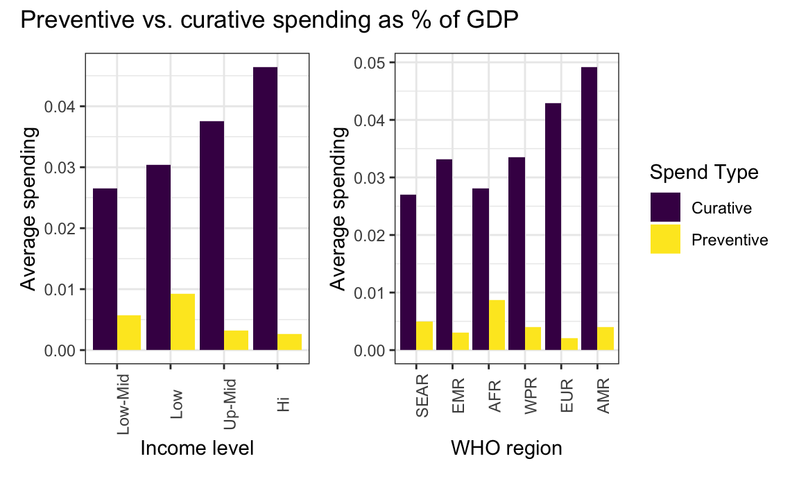
On average, countries across all income groups and WHO regions spent much more on curative care than on preventative care as a percent of GDP. High income countries spent the most on average on curative care. However, low income countries actually spent the most on preventative care as a percent of GDP. The region of the Americas spent the most on average on curative care. It is interesting that the African region actually spent the most on preventative care as a percent of GDP.
The plots below show the average show the average preventive vs. curative spending as a percent of current health expenditure in 2019 for income levels and WHO regions.
cp_df_che =
  ghed_df %>%
  filter(year == 2019) %>%
  drop_na(hc1_usd2019, hc6_usd2019, che_usd2019) %>%
  group_by(income_group) %>%
  summarize(
    n_countries = n(),
    `Curative` = mean(hc1_usd2019 / che_usd2019),
    `Preventive` = mean(hc6_usd2019 / che_usd2019)
  ) %>%
  pivot_longer(
    `Curative`:`Preventive`,
    names_to = "Spend Type",
    values_to = "average_spending"
  )

income_cp_che =
  cp_df_che %>%
    ggplot(aes(x = reorder(income_group, average_spending), y = average_spending, fill = `Spend Type`)) +
    geom_bar(stat = "Identity", position = "Dodge") +
    labs(
      x = "Income level",
      y = "Average spending"
    ) +
  theme(axis.text.x = element_text(angle = 90)) +
  theme(legend.position = "none")

cp_df_che_2 =
  ghed_df %>%
  filter(year == 2019) %>%
  drop_na(hc1_usd2019, hc6_usd2019, che_usd2019) %>%
  group_by(region_who) %>%
  summarize(
    n_countries = n(),
    `Curative` = mean(hc1_usd2019 / che_usd2019),
    `Preventive` = mean(hc6_usd2019 / che_usd2019)
  ) %>%
  pivot_longer(
    `Curative`:`Preventive`,
    names_to = "Spend Type",
    values_to = "average_spending"
  )

group_cp_che =
    cp_df_che_2 %>%
    ggplot(aes(x = reorder(region_who, average_spending), y = average_spending, fill = `Spend Type`)) +
    geom_bar(stat = "Identity", position = "Dodge") +
    labs(
      x = "WHO region",
      y = "Average spending"
    ) +
  theme(axis.text.x = element_text(angle = 90)) +
  theme(legend.position = "right")

combined_cp_che <- income_cp_che + group_cp_che

combined_cp_che +
  plot_annotation(
    title = "Preventive vs. curative spending as % of current health expenditure"
  )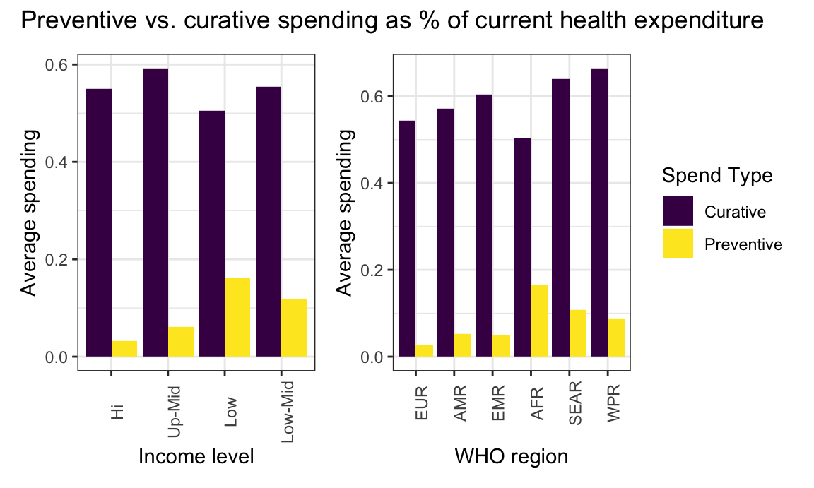
On average, countries in all income levels and WHO regions spent significantly more on curative care than preventative care as a percent of current health expenditure. Upper-middle income countries actually spent the most on curative care, while low income countries spent the least. High income and lower-middle income countries spent relatively similar amounts on curative care as a percent of current health expenditure. Again, low income countries spent the most on average on preventative care as a percent of current health expenditure. The Western Pacific region actually spent the most on curative care, while the European region only spent the second highest on curative care. The African region spent the least on curative care, though countries in this region actually spent the most on average on preventative care as a percent of current health expenditure.
Click here to return to the main page.