Zoom In: USA
ghed_df <-
  read_excel("data/GHED_data.XLSX") %>%
  janitor::clean_names()

us_df <- read_csv("data/us_health.csv", skip = 2, n_max = 52) %>%
  janitor::clean_names() %>%
  mutate(
      r01_total_revenue = as.numeric(r01_total_revenue),
      state = tolower(state),
      `% of total expenditure` =
        (e055_health_direct_expend / e001_total_expenditure) * 100
    )

us_states <- map_data("state")
United States Health Expenditure
We decided to further our analysis by specifically zooming in on the United States (US).
exp_per_cap <- ghed_df %>%
  filter(country == "United States of America") %>%
  select(country, year, gghed_pc_usd, pvtd_pc_usd) %>%
  pivot_longer(cols = contains("pc_usd"),
               names_to = "exp_type",
               values_to = "exp_per_cap") %>%
  mutate(exp_type = replace(exp_type, exp_type == "gghed_pc_usd", "Government Expenditure per Capita (USD)"),
           exp_type = replace(exp_type, exp_type == "pvtd_pc_usd", "Private Expenditure per Capita (USD)")) %>%
  plot_ly(x = ~year, y = ~exp_per_cap, name = ~exp_type, color = ~exp_type, colors = "viridis", type = 'scatter', mode = 'lines+markers', showlegend = F) %>%
    layout( yaxis = list(title = 'Expenditure per Capita (USD)'), xaxis = list(title = "Year"))

exp_per <- ghed_df %>%
  filter(country == "United States of America") %>%
  select(country, year, gghed_che, pvtd_che) %>%
  mutate(sum_per = gghed_che + pvtd_che) %>%
  pivot_longer(cols = contains("che"),
               names_to = "exp_type",
               values_to = "exp_per") %>%
  mutate(exp_type = replace(exp_type, exp_type == "gghed_che", "Government Expenditure"),
           exp_type = replace(exp_type, exp_type == "pvtd_che", "Private Expenditure")) %>%
  plot_ly(x = ~year, y = ~exp_per, name = ~exp_type, color = ~exp_type, colors = "viridis", type = 'scatter', mode = 'lines+markers') %>%
    layout(yaxis = list(title = 'Percent of Total Expenditure'), xaxis = list(title = "Year"))

fig <- subplot(exp_per_cap, exp_per,nrows = 2, titleY = TRUE, titleX = TRUE, shareY = FALSE) %>%
  layout(title = 'Health Expenditure in the USA Over Time')

fig
These line plots above visualize health spending in the U.S. from 2000-2019 in two different ways: in per capita US$ and in % of total healthcare expenditure. The graph on the top highlights how the cost of health per person has increased each year for the last two decades. The graph on the bottom shows how government spending on health gradually overtook private spending around 2013. Both graphs show that the amount and percent of government expenditure is increasing in the U.S. In the early 2000s, private expenditure was a majority of the total US health expenditure, but this is continuing to decrease as the US puts a greater emphasis on government expenditure. This is likely a result of recent elected officials focusing on creating more government-sponsored healthcare programs.
Another interesting trend we noticed from these line plots is a shift towards more government expenditure per capita US$ and in % of total healthcare expenditure starting around 2013. In 2000, there was significantly more private expenditure, but over time private expenditure decreased and there was a switch to there being more government expenditure around 2013. This could be due to the introduction of the Affordable Care Act and its implications.
Based on this report, President Obama introduced the Affordable Care Act in 2010, and open enrollment into the program began in 2013. This could explain why there was a shift towards more government expenditure around 2013.
We also wanted to examine patterns in health care expenditure in the US in specific states. We did this by creating a map displaying the % of total expenditure towards health in 2019 for each state.
us_states %>%
  left_join(us_df, by = c("region" = "state")) %>%
  ggplot(aes(x = long, y = lat, group = group, fill = `% of total expenditure`)) +
  geom_polygon(color = "gray90", size = 0.1) +
  coord_map(projection = "albers", lat0 = 45, lat1 = 55) +
  theme(legend.position = "bottom",
        axis.line = element_blank(),
        axis.text = element_blank(),
        axis.ticks = element_blank(),
        axis.title = element_blank(),
        panel.background = element_blank(),
        panel.border = element_blank(),
        panel.grid = element_blank()
        ) +
  labs(
    title = "% of Total Expenditure Put Towards Health in 2019"
  )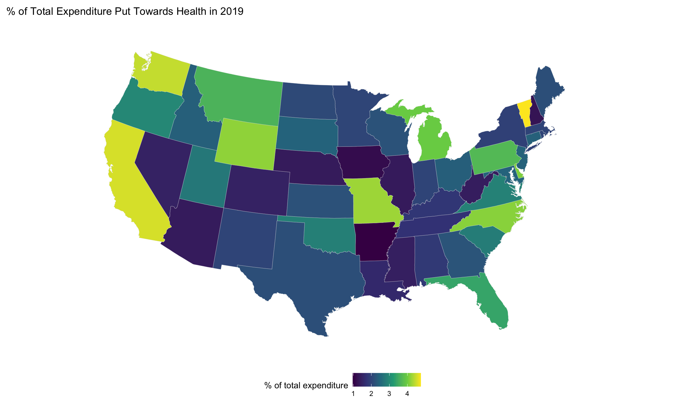
We can see here from this map that the states that put the most of their state and local spending towards health care are Vermont, California, and Washington. The states that contribute the least of their expenditure towards health care are Arkansas, Iowa, and New Hampshire. It’s interesting to see how spending varies so widely, even within regions. Take the drastic difference between New Hampshire and Vermont as an example. They are neighbors, but their health expenditure varies significantly.
Click here to return to the main page.